


Walter Nikkels – Denkwerk
Le prix initial était : 350,00 €.96,99 €Le prix actuel est : 96,99 €.
- Options de livraison rapides et fiables
- Rapide, amical, toujours là pour vous aider.
- Période de garantie gratuite de 1 an
- Votre satisfaction est garantie à 100 %.

Walter Nikkels’ designs and sketches for the invitation cards for the Stedelijk Museum Amsterdam.
Typography, the determination of the placement of words and images on the page and the working of these into a visual rhythm, has a certain intimacy – just as opening a book is intimate and for my eyes alone. Due to the typography, letters and words are situated next to, above and below each other, while the image has its modest place among them; and in this way the distinct form of the letters and the words and the images convey the form of the meaning. Typography shows the words or, I should say, typography brings them closer so that they can be read. Walter Nikkels is a master of this. He deals with the material very carefully; that’s visible, it’s his character. One time, on a journey through the Po Valley in winter: mist lingered in the early morning, later the sun came out. The lonely farmhouses lay in fine, filtered, diffused light. On their sunny side the walls were bright pink; the shady side wasn’t much darker and the pink almost as bright. Even so, both sides stood out sharply. Such simple precision and subtlety also characterizes the typography of Walter Nikkels in its fundamental relationships.
Published on the occasion of the exhibition WALTER NIKKELS: EENWERK OTHER WORK MEERWERK from September 21 to November 16, 2024
Limited edition of 300 numbered and signed copies
Edited by Irma Boom, Mathieu Lommen, Liesbeth Kruyt
Translated by Beth O’Brien
Book made by Irma Boom
Texts by Rudi Fuchs, Irma Boom (NL+ENG)
Softcover in a black box
203 × 152 mm
1000 pages
Full color
IBO 60 gsm paper
© EENWERK
Soyez le premier à laisser votre avis sur “Walter Nikkels – Denkwerk”
Produits similaires

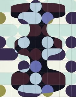
Affiches / Estampes
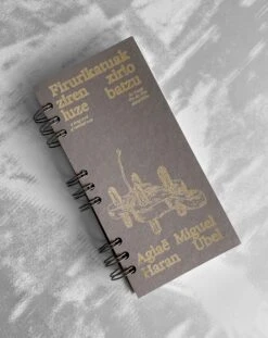
Livres
Affiches / Estampes

Affiches / Estampes
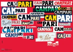
Bruno Munari – Declinazione Grafica Del Nome Campari, 1964 (Poster)


Objets
Avis
Il n’y a pas encore d’avis.